*old tut moved over from my old site*
This tutorial was written by me Diane Knight on 14th FEB 2009 any resemblance to any other tut is purely coincidental
things you will need:
PSP and animation shop
and a fairly good knowledge of both, as we will be working with lots of layers
for this tut we will not be using any templates, just the kit and a tube.....
scrap kit, I used a fab FREE kit 'All Loved up' by my pal Twinky HERE
MASK no 81 from weescotslass download it and lots more fab masks from her site HERE
MASK no 81 from weescotslass download it and lots more fab masks from her site HERE
Font used was Shark Random Funnyness - get it FREE HERE
For this tut I am using the artwork of Rion Vernon you will need to buy a licence to use this artists work at CDO, I bought my tubes long ago from GILD which is now closed.
....................................................
place the masks in your mask folder
open A NEW canvas 650 x 450
i like room to work....
i like room to work....
open up paper 2 from the kit, copy and paste the paper onto your canvas,
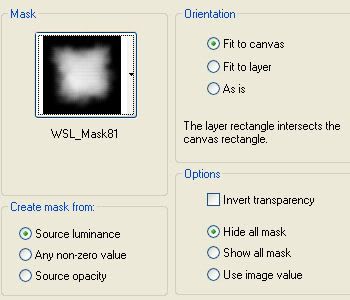
then apply the mask see correct settings below...
go to Layers - merge group,
this falls a little short of where i want it...so duplicate it, move one slightly up and 1 slightly down so that you have a more even coverage for your background
see below..
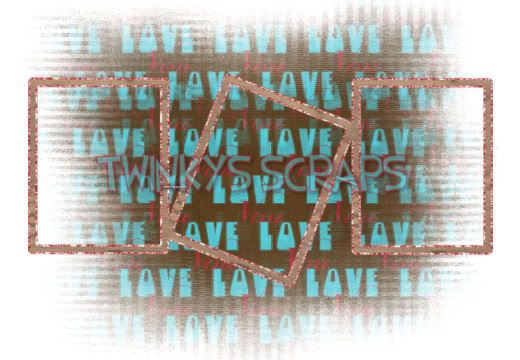
this falls a little short of where i want it...so duplicate it, move one slightly up and 1 slightly down so that you have a more even coverage for your background
see below..

open the frame called Twinky_AllLovedUp_FramesSquare.png
resize it by 80% using smartsize
resize it by 80% using smartsize
copy and paste it onto your canvas
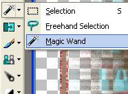
now select the magic wand tool
now select the magic wand tool
to select all 3 at the same time, hold down the shift key and click inside each frame
now copy and paste paper11 from the kit as a new layer , go to Selections- Invert and then hit the delete key.
slide the paper layer underneath the frame
now open up heartframe2 from the kit, go to Image Mirror,
then resize it by 60% using smartsize,
rotate Right by 20%
see my tag for placement
rotate Right by 20%
see my tag for placement
at this point its important to check your heartFrame is underneath the square frame.
now add the heart border from the kit, this goes on the layer above the square frame,
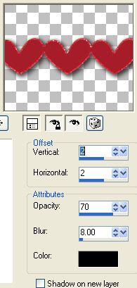
resize this by 70% using smartsize. and add a drop shadow as follows...
resize this by 70% using smartsize. and add a drop shadow as follows...
ok remember the heart frame we added before i want you to dupliacte it, and bring the duplicated one to the top layer
so now you have 1 heartframe below the square frame and 1 above..
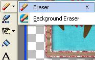
and erase the section of the top heart that i have marked in white.see below...
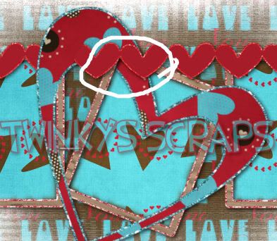
ok yours may not have been too tidy, I know mine wasnt, so we are going to add a safety pin to hide any imperfections....I chose the blue one from the kit and just resized mine by 60%
add a drop shadow... same as before
you can either fill the heartframe with paper9 as i did or not, either way looks good.
if you do want to, Select inside the heart frame (the bottom one) using the same method as before and fill it with paper9
now add a drop shadow for the bottom heartframe and the square frame too...using the same drop shadow settings as before.
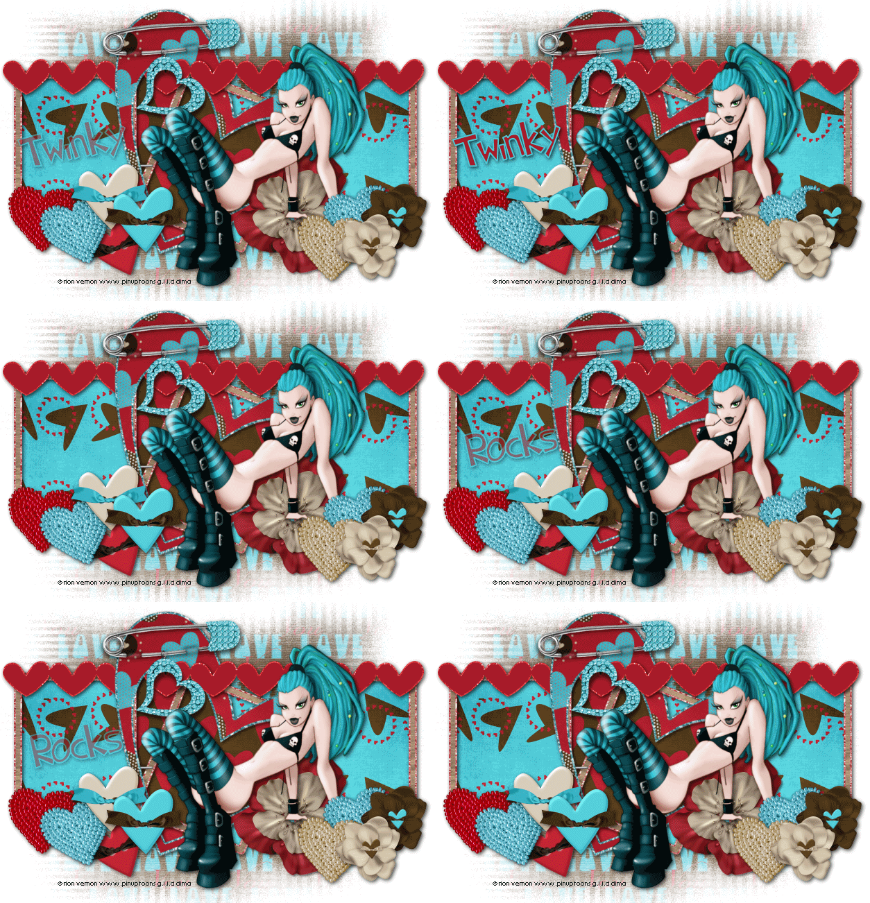
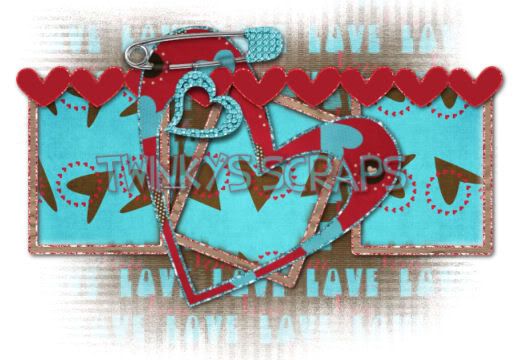
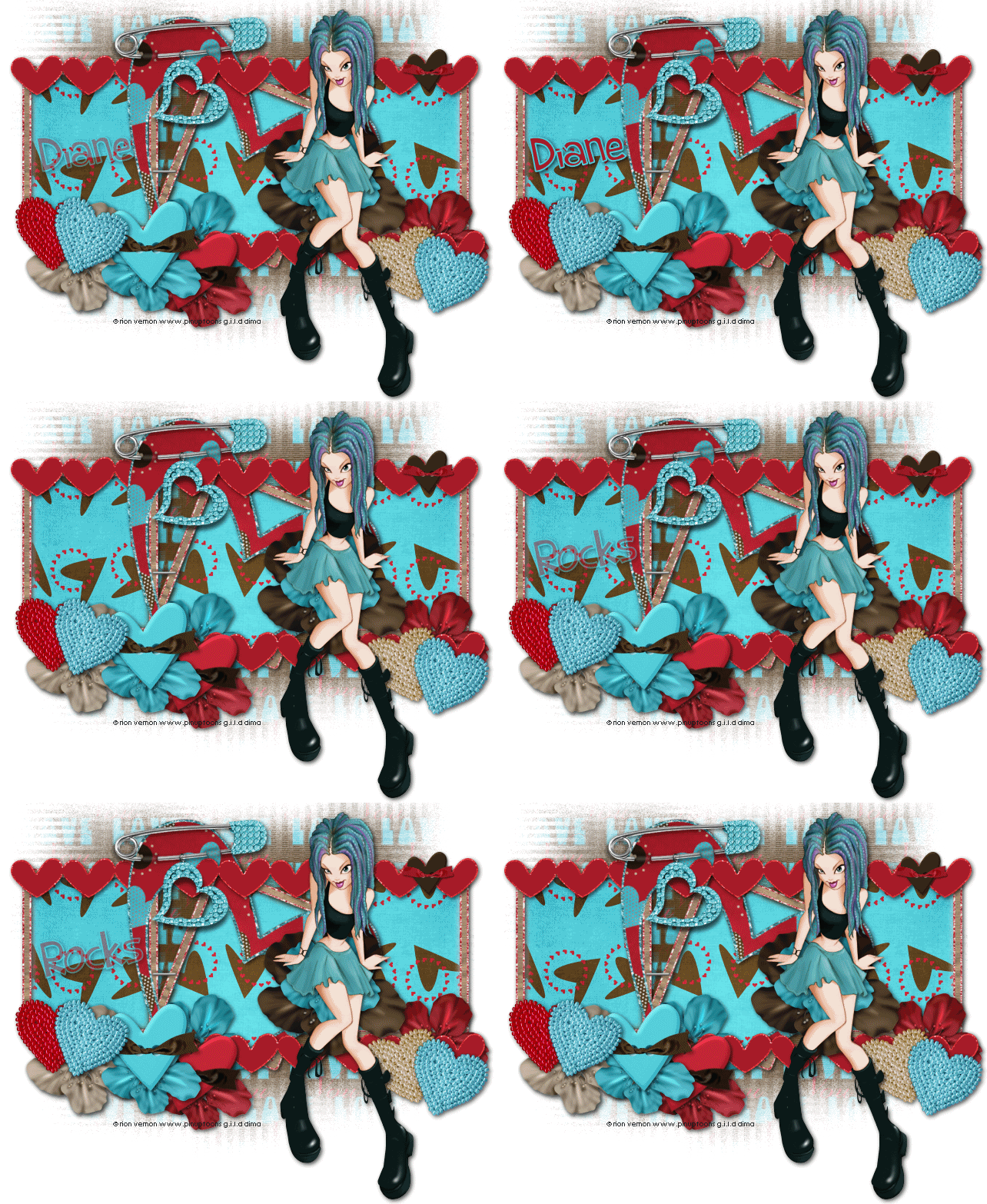
ok so far this is what I have ..you should also have something similar...
then I added Appleblossom1 resized it by 60% added the same drop shadow as before, and place it to the right. where her hand is, then added Appleblossom3 and resized that by 40% and placed it directly in the middle of the flower before , again added a drop shadow.
you can now add your tube...I used Rion for both the top and bottom tags...then add more elements from the kit, there are some fab ones ..
I wont insult you by telling you exactly where i placed what where, you should be able to tell by looking at the tag....but mostly i used the heart beads, which i resized by 25% using smartsize, I also rotated a couple left by 20%
I also used the Heart buttons which i resized by 60%, I also rotated a couple of these,left by 20%
in the top tag I also used flower 3 & 4 , these i resize by 25% always using smartsize.
now add your artist ©
now its time to animate the text..
........................................
font used was SHARK RANDOM FUN - with these settings
foreground blue colour - #4ec8d5
background red colour - #a61c29
background red colour - #a61c29
add your name using the settings above,
I rotated mine slightly, then add a drop shadow.same as before..
reduce the opacity of the your name to 50%
then copy merged into animations shop,as a new animation
then copy merged into animations shop,as a new animation
back to PSP
raise the opacity of the your name to 100%
then copy merged into animations shop,this time after current frame
then copy merged into animations shop,this time after current frame
back to PSP
reduce the opacity of the your name back to 50%
then copy merged into animations shop,as a new animation
then copy merged into animations shop,as a new animation
back to PSP
reduce opacity of your name to '0' then copy merged into animations shop, after current frame.
back to PSP
now add the word 'Rocks' next, using the same settings as before, dont forget to add the same drop shadow as before....and if you slanted your text, do so again...
now make your name visible for a second, just while you line up the word 'rocks', you want it in the same place, otherwise it will look like its jumping. once you have it lined up, lower the opacity of your name to '0' again ...
now lower the opacity of the word 'rocks' to 50% and copy merged into animation shop, after current frame.
back to PSP
raise the opacity to 100%, coopy merged into animation shop, after current frame.
back to PSP
slide the opacity back to 50% , coopy merged into animation shop, after current frame.
back to PSP
for the last frame you want to slide the opacity to '0' so you cannot see any text ... copy merged into animation shop, after current frame.
now in animation shop you will want to slow the animation sown a little ..so go to Animation - frame properties, change the number to 20 or 25 that usually looks good...
now view the animation you should have animated text like mine!
save it as a gif and you are done....
save it as a gif and you are done....







No comments:
Post a Comment